
Canvas is allowing us to be more effective and creative in using graphics, layout design, templates, and many other aspects of what constitutes good practice and web design principles. But what do students find most useful?
Students have a keen eye for detail when looking at your Canvas sites.
The tips below reference data and ideas from our recent student Canvas feedback survey. We’ve narrowed down their top 5 suggestions for improving the Canvas experience and each one can be implemented in less than ten minutes. As well as improving the student experience, they will help make your site easier to maintain and reduce student enquiries.
This post was contributed by Pamela Brañas and David Yeats.
Organisation
Tip 1: Start a new page when one gets overcrowded.
The placement and amount of content on a page is a fine balance which depends on many factors. This could be a combination of images, videos, diagrams, and text. All of these elements help to illustrate the concepts being taught.
However, when a page becomes too long, you may need to scroll (sometimes very far!) to get to the relevant information. There becomes a point at which it is better to create a second page, giving students a quick path to the content they are looking for. This is also a way to help create chunks of related information allowing students to naturally pause and review. Simply grab the overflow of content by type, such as media, additional readings, or external links and drop it onto a new page with a title which references which part of the course it relates to. For example, “Week 2 part 2”.
Make sure the pages are next to one another in the relevant module so that students can naturally flick to the “next” page.
Tip 2: On individual pages, use bullet points for lists of links, readings and questions.
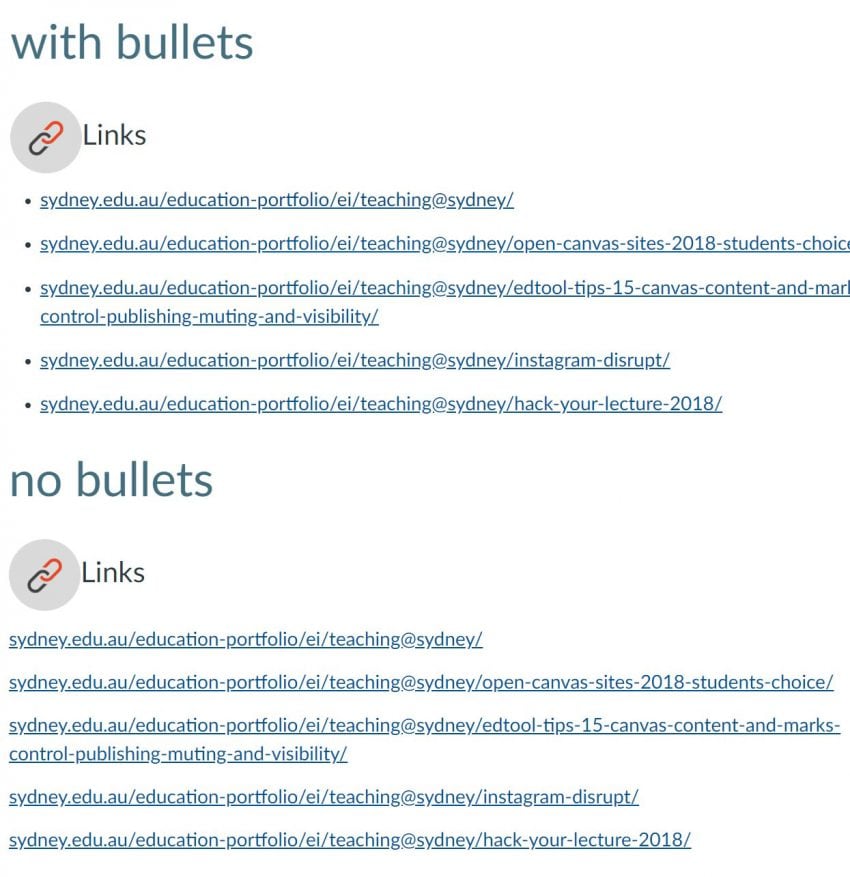
It can take time to go back and completely revise how you’ve built your Canvas sites, but adding bullet points is a quick amendment you can make to aid in the overall organisation and assist in ease of navigation. This becomes more and more important as additional content and resources are added.
Ensure each item on your list starts on a new line then select the entire list and click the bullet or numbering tool in the editor. You will notice after saving the page that the list gets gathered together and appears as a clear chunk on the page.
Tip 3: In Assignments, use multiple assignment groups to organise the content.
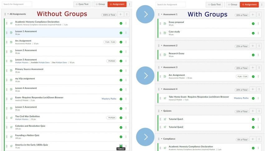 Assignment groups also help to create chunks of content. These need not be too descriptive; a simple Assessment 1, Assessment 2, in accordance with your unit outline, is enough to make this page more organised.
Then, you can add the relevant percentage weightings to each group. A long list of assignments all gathered into one group might be daunting to students, but a few assignments gathered into several groups can seem more manageable.
Navigation
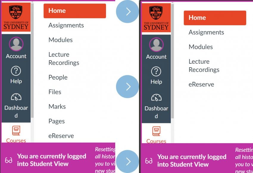 The Course Navigation menu (alongside the Home page) is one of the important areas of your site as students will use it repeatedly to access resources, such as Home, Modules, Announcements, Marks and Assessments. However, generally Pages and Files should be hidden from the Course Navigation menu. These point to areas where you make and upload the content that appear in the site with no organisation. Unless you have a very simple site with only a handful of pages, these areas will present content with no context. Students usually don’t need to access these areas – it is better to organise Pages in Modules with links to files, like the pages of a textbook are placed in chapters.
Aesthetics
Tip 4: Add icons to links on your homepage.
When you think of the Home page to your unit, students should know at-a-glance where to find what they really need to get started. This can include your unit outline, the weekly materials, lecture recordings, practice exercises, assignment information, and quizzes. Therefore, you want students to be clear on how to access your unit without opening multiple windows. This is a win!
Icons and buttons can make landing on the home page a happier moment. You can find them in Canvas Commons: look for ‘Icons for Canvas pages’ or ‘Icons for Canvas pages – elegant grayscale’. Try using them and see how students respond. Simply click and go to where you need to be. Many of the sites ranked highly by students have very simple home pages with consistent use of icons.
By the way, keep that Accessibility checklist poster above your desk. We can never emphasise too much how important the accessibility of your sites is to students. This poster include good practical tips on using the design elements to help all students have a positive experiences in the LMS.
Dead Ends
Tip 5: If you change a page name, be sure to update any links to that page.
When changing the title of a page be sure to update the links to this page – Canvas doesn’t update these links for you! If the title of a page is changed, it means the links from other content to this page is lost.
It is also commonly noted that students run across a blank page with no content. The reason for this is that the page has a title, it has been published and is now visible to your students… Oops!
A good approach when tackling pages is to leave them all unpublished while you are gathering your thoughts and writing the content, then publish as you go throughout the semester.
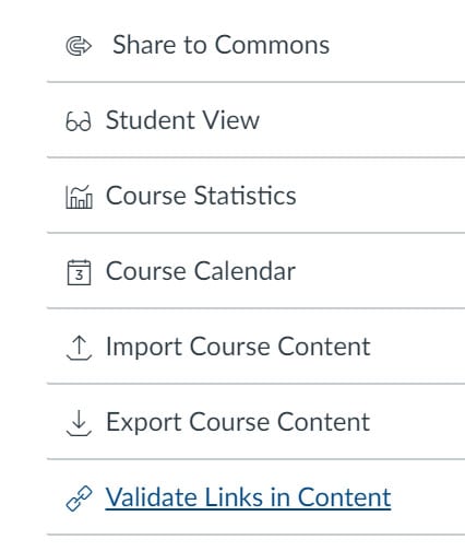
As we all know, finding broken links on a website is very frustrating and students’ experience on Canvas is no different. It is a good idea to check the links on your site regularly. To do this, go to Settings and use the Validate Links in Content tool in the right hand menu.
Tell me more!
- Visit the University’s Teaching Resources Hub for tips on using Canvas and other educational technologies successfully.
- Check out some of the Open Canvas Sites – 2018 students’ choice, 2018 semester 1, and 2017 semester 2.
- Come along to a Canvas session run by Educational Innovation.
- Take a look at the many useful and practical Canvas articles here on Teaching@Sydney/